been busy animating...and eating cake... but im going to try and find a way to put my flash tests in a movie file and slap them up here for ya'll... sadly, i cant do that with cake...
but in the mean time..... CLUTTER!! there so much clutter! do you guys have any advice on how to make this one battle field piece a little less busy? its a bit too much with all the bodies and roughed in back ground, but how else can i keep the feeling a little dark? ... maybe alter the coloring?
next piece:
ok, so im trying to work out of a black and white back ground so i can focus on lighting issues and composition issues, any suggestions would be amaaaazing!
heres what was supposed to be there, please let me know if any of this comes through in the piece :D
-foggy sky
-marshlands
-and a somber or grim mood for the piece......
ali
6.28.2011
6.21.2011
Gone for a minute, but I'm back
Hey guys sorry I haven't been posting anything in a while, I wasn't feeling to great about my work. But that's the past and I'm over it.
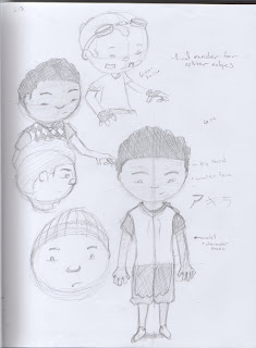 It's the biggest character on the bottom right.
I decided that I would work on my original senior thesis because it's a pretty simple idea and I can work on my acting skills with it. I have spent the past few days working on the character design, continuing with what I had last summer to now and rediscovered an artist that I like a lot names Ghislain Avrillon. His characters are pretty simple and not too different from the way I draw, so I studied his characters a little and came up with this guy. For the time being his name will be Slamar.
 It's the biggest character on the bottom right.
Let me know what you think, I should have an orthographic of him and the other characters in the animation pretty soon.
-Stephen
6.20.2011
062011_the weekly
I've been lucky enough to be really busy this week working on a bunch of stuff that I can't really show. Some of the products of that however was me learning how to make building brushes. I think over the next couple of weeks you see me start pushing toward working in PS more. I really want to try using it for digital painting more. Especially speedpain ting...it's got a lot of nice tools. Anyways, I found some pictures of interesting repetitive buildings and just doctored them up a bit to make brushes like these and they work extremely well.
On a side note I have this sketch of a really sad guy... I guess I wanted to try extreme emotion and I'm considering having characters like this in an ongoing graphic novel project this next year at school. Some kinda thesis thing I guess. We shall see!
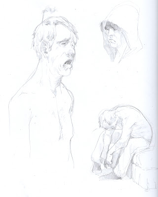
Eric.
 ting...it's got a lot of nice tools. Anyways, I found some pictures of interesting repetitive buildings and just doctored them up a bit to make brushes like these and they work extremely well.
On a side note I have this sketch of a really sad guy... I guess I wanted to try extreme emotion and I'm considering having characters like this in an ongoing graphic novel project this next year at school. Some kinda thesis thing I guess. We shall see!

Eric.
6.13.2011
Some revisions
Thought id post some revisions to theses two characters i had first posted on my blog. they were both reeeealy boring so i sat on them for a while, forgot about them, then made these revisions a few days ago. also, an attempt at fixing some of the problems of the first environmental piece i put up here.
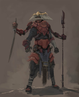 This guy is supposed to have prosthetic arms attached to his armor chest/back piece, to pull of a total general grievous. I think I am starting to find a little balance on details with a little "muddyness"
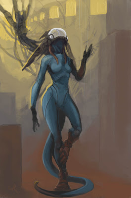 I have no idea what this chick is supposed to be, she started off as a silhouette doodle, and then evolved into this thing, but i kinda like it.
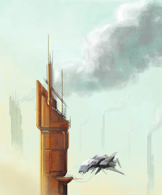 I did a few alterations with this guy, played with the saturation, levels, and atmospheric shit like you suggested eric, and then changed the ship around and added a tube proboscis thing so he might be refueling? mabye?, idk, i tried playing around with a platform there, but to make it big enough for the ship to land on, it created a really perpendicular right angled composition that i just wasnt digging.
 This guy is supposed to have prosthetic arms attached to his armor chest/back piece, to pull of a total general grievous. I think I am starting to find a little balance on details with a little "muddyness"
 I have no idea what this chick is supposed to be, she started off as a silhouette doodle, and then evolved into this thing, but i kinda like it.
 I did a few alterations with this guy, played with the saturation, levels, and atmospheric shit like you suggested eric, and then changed the ship around and added a tube proboscis thing so he might be refueling? mabye?, idk, i tried playing around with a platform there, but to make it big enough for the ship to land on, it created a really perpendicular right angled composition that i just wasnt digging.
 also, i am going to try and put up some environment thumbnails up here in the next few days, cause work has slowed down a little, and ill have a little extra free time this week.
p.s.
California is pretty sweet. dont believe anybody when they say its "hot" out here, cause it aint got shit on the midwest.
6.11.2011
ahhhhh.... internet
Here yah go eric, I really couldnt find anything to change outside of what everyone said already in the comments and actually, I think I screwed up the pipeline piece now that I'm looking at the original again. but, I felt that maybe the tunnel opening shouldn't be in the dead center and so moved it over a little, and with the others some foreground objects seemed to make them a little more three dimensional....maybe? they honestly are very strong on their own and so I was having a really tough time to find anything that could be fixed. so hopefully, this helps in any way :)
also here is one of the speed paintings you put up earlier, its a very good piece and it carries alot of story potential with it. I simply tweaked the levels a little to give it what I thought might be a more dynamic feel... although you might not like how dark it is because it changes the mood a little and loses some of those awesome details...
also here is one of the speed paintings you put up earlier, its a very good piece and it carries alot of story potential with it. I simply tweaked the levels a little to give it what I thought might be a more dynamic feel... although you might not like how dark it is because it changes the mood a little and loses some of those awesome details...
6.08.2011


 Right now I am working on figure drawing and my original senior thesis. So far as these drawings go they are for the most part drawing from reference. Right now with figure drawing I am just trying to get better at it so any critique as far as proportion and space with the figure goes is appreciated. This is the main character I am going to model fully soon. Right now I have an old model I made and will be doing some test animations with it. I also am modeling rigging a low detail mech so that I can animate and work on the finished models at the same time, to keep practice up. I need to make orthographics of both characters which I will try to have done for this weekend. Any suggestions of figure drawing or good exercises to get better at it would be appreciated, I will have a solid thing for you to critique on character design next week.
6.05.2011
050611_strugging with environments
So I'm back in St. Louis and am struggling to get my act together. But I pulled this stuff out for today. Some good, some bad. All speedies. Next week I'll be much less apologetic.
Basically I'm still trying to screw around with the same concepts. I think I'm just not spending enough time with any one of these pieces and that's the problem. We'll see where next week brings me. This one is a speedie/photo study that I embellished to help the space work a little bit better. I need to find a quick way to paint lots of windows really fast. That'd be really helpful for some of these environments. I think I might start taking on the EOW challenges on CA, or at least using them for source material.
 Do we want to try to do some sort of topic based challenges for the week amongst ourselves though? I know we kind of vaguely discussed doing something like that, it might be good to do. Then we can all post wip's and get feedback as we work. Thoughts?
Also: CHECK THIS OUT. Kansas City just got more awesomer.
http://www.spectrumfantasticart.com/spectrumfantasticartlive/
eth.
Basically I'm still trying to screw around with the same concepts. I think I'm just not spending enough time with any one of these pieces and that's the problem. We'll see where next week brings me.
 This one is a speedie/photo study that I embellished to help the space work a little bit better. I need to find a quick way to paint lots of windows really fast. That'd be really helpful for some of these environments. I think I might start taking on the EOW challenges on CA, or at least using them for source material.
 Do we want to try to do some sort of topic based challenges for the week amongst ourselves though? I know we kind of vaguely discussed doing something like that, it might be good to do. Then we can all post wip's and get feedback as we work. Thoughts?
Also: CHECK THIS OUT. Kansas City just got more awesomer.
http://www.spectrumfantasticart.com/spectrumfantasticartlive/
eth.
6.04.2011
after catching up on this thread..
hmmm, I would think my biggest flaws would be composition and color.... well... not the biggest... but they are the ones that need to be addressed as soon as possible. OH! and my senior thesis crap that i'll be wanting you guys to look at. I'll be plastering stuff up here over the summer and bugging you all for critiques (prepare yourselves) so let the learning begin and let flow the sagely advice! :D
starting off, here is a guy I have fallen in love with ...well his back grounds anyways. His name is manuel tanon-tchi and here is his lovely blog-
http://manueltanontchi.blogspot.com/
- the type of look im shooting for...
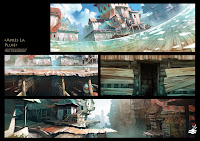
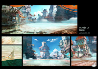
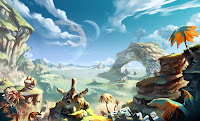
starting off, here is a guy I have fallen in love with ...well his back grounds anyways. His name is manuel tanon-tchi and here is his lovely blog-
http://manueltanontchi.blogspot.com/
- the type of look im shooting for...


This is ALL Manuel Tanon-tchi, and in NO way, shape or form mine.
some stuff for thesis
It has been a gloriously long time since I posted anything up on here. and all I have to show so far are some poopy pieces that are geared towards my thesis, but here are the ideas for the main girl character, i'll throw up the guy in a little bit. Its not much but dag-nabbit its something for right now :)
-I am really in love with the little red heads on the bottom row and will more than likely continue down that direction.
-I am really in love with the little red heads on the bottom row and will more than likely continue down that direction.
Subscribe to:
Comments (Atom)


