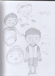
I decided that I would work on my original senior thesis because it's a pretty simple idea and I can work on my acting skills with it. I have spent the past few days working on the character design, continuing with what I had last summer to now and rediscovered an artist that I like a lot names Ghislain Avrillon. His characters are pretty simple and not too different from the way I draw, so I studied his characters a little and came up with this guy. For the time being his name will be Slamar.
 It's the biggest character on the bottom right.
Let me know what you think, I should have an orthographic of him and the other characters in the animation pretty soon.
-Stephen
Really digging the character design, Stephen, I think he's got good proportions! I'm looking forward to seeing more of him. Also -- I noticed in your study of Ghislain's work that he has 3 fingers rather than 4. Going with 3 can lend an impressive amount of simplicity to the character and it pushes him into a little bit more childike, absurd realm. I think having four fingers can be a little cramped sometimes on small-limbed characters.
ReplyDeleteThis is--of course, all my subjective opinion and you might want to keep with the realism that it gives or what have you. Whatever the case. Rock on.
Remember: Not feeling good about your work is only reason to POST MORE.
Eth.
I never really thought about the finger thing before. I will have to consider it.
ReplyDeleteThanks
nice! I like him!! and i think the finger idea is a good point. also, while i like this original design, im a sucker for that beanie hat on the left, ito me it makes the character look more child like and energetic... but, thats just a personal opinion :p
ReplyDelete