5.30.2011

Rain garden update

Well I didn't get a chance to work on some of the things that you guys said about the piece before, but I just finished the rest of the piece. I will definitely see to some of those things, I'm not to sure about the cloud thing though, I'm just not sure if that would fit with the style of everything else if it squashed and stretched. But what if it was just there behind the text?

Anyway here's the rest of the video:


After this week, all of my posts will look a lot more like what I've been doing before this. So I think I should probably follow Eric and Casey and tell you what I want to work on. I think I was following this course the entire time I was animating, but I just realized that I would like to become a character animator or at least get really good at it. So I've been trying to focus on my acting and posing in my animation, you can see most of it in Robo-san. But like I said before I will have other animation that will try to reflect that, so any advice is great.

-Stephen

Finally!


At long last! I have dependable internet, so the posts will flow, like a river of awesome-sauce cascading down the venerable slopes of mount Radical. Just like that, except more like mediocre-sauce, or just plain bland-sauce. like seriously, i need help.

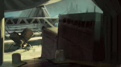
As per Eric's request of coming out with our weak points from the get-go, I am going to focus on environments too. because I......suck......at environments.

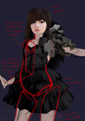
so, anywhoose, here is a commemorative doodle to inaugurate myself to posting on CC, along with an environment in progress, so tell me whatcha think!
I guess this guy is supposed to be a vapor stack, pumping out greenhouse gases with water vapor during the early stages of terraforming a planet. The ship is dropping off supplies, i suppose...
....and this guy is a very special chimera! and confused.

-Fluke

sunday post

This week mostly kicked my ass unfortunately. I did bust this out just to have something to show, though. I'm very much still struggling with finding the right brushes to approach these harder-edged environments. I wonder that painter just may not be the best weapon to use against architectural environment painting. I see Craig Mullins and others pull off effects I've tried time and time again to achieve in Painter and I just can't because of the way the brushes build up. It pains me to say it but I might have to really dig deep and step into PS to explore more digital painting techniques.
I think the problem for me is mostly in the lack of planning I put forth in the very beginning. I'm not laying down strong structure and planning from the offset, so things are falling apart. I'd love to get some feedback from you guys, I'm really sucking it up and posting these because I don't feel proud of them in the least, but I know I need critical feedback.
Also, where is everyone?

eth.

5.24.2011

Ben Dallman 2011 Animation Reel Critique


Here is my latest reel, tell me what you guys think or what I could fix before I send it out to everything that moves.

Also if there are any other shots that I could put in from the shots I did on the Robo-san project let me know, here is a link to the shots that I finished.

Stephen Animation post

Sorry this is a little late, but I had to get some work done on an animation for my CASL internship. But I think I still want critique on it because it would be a good piece in my reel to show that I have done some commercial work.

So if there is anything that you guys can think of, maybe like if the text is too fast or if the compositions are terrible. At least anything like that is what I want to get better at with commercial stuff. But anything else is game too.


Stephen

5.20.2011

thoughts on environments

I was thinking it might be a good idea for us to each kind of establish what it is we feel we really want to work on or what our biggest weaknesses are. And also to highlight the ones that are the obvious weaknesses and the ones we might typically try to ignore. This could be especially effective for getting quick improvement on these issues. If we all know everyone else's weaknesses and what they're focusing on, critiques can be tailor made so we don't linger on what's unimportant and just focus on tuning up the weakest link.

For me, the one I try to ignore is my difficulty with hard lined objects. Buildings, machines, etc. So that's one thing that I usually just try to carefully avoid and now I want to try to tackle head on, no matter how embarrassing.

So with that said I started looking at the work of artists that I really admire in terms of environments and everything else and try to piece together information about why what they do looks so good. Here are my thoughts. Please comment and your own.


I snagged all these images but one from the CA.org EOW category winners and will credit them accordingly. The first is a sketch by Andrew Ley. What I was noticing as I looked at all of these works amidst the rest of the EOW competitors was that the ones that fell flat didn't really do so because of design, though that was part of it, they were mostly just flat and had no sense of space whatsoever. When I started trying to figure out why and how these works particularly are successful I started to see some running trends.The first of these is that in the most effective concept pieces, the artist took every chance they had to use perspective. Every chance. It's to the point where I would wonder if the design is almost determined by the needs of the image at times, meaning the shapes of buildings and their surroundings change in accordance with the composition, not just the ideals of the artist. In Andrew's piece he's turned the ground plane into a grid so we can easily see receding space as well as using atmospheric perspective. He also reinforces the perspective by having repeating columns on the sides that are basically perspective markers. The scratchy lines on the pavement also make sure that the ground really appears flat.
The next guy, Stokes does some of the same tricks. He pushes the atmospheric perspective to really make things go back in space. He uses another dominant vanishing point in his composition but he introduces something interesting. He doesn't just have pipes receding into space, he makes catwalks and planks that zigzag across them which give us some real scale and distance, especially with the figure. It's also good to note that neither of these guys made the horizon line parallel to the picture plane, always on a tilt.
Craig Mullins is of course the man, and one thing that I noticed about his works is that whenever he has flat surfaces, any at all in his environments, he puts a texture or pattern on them to let us see how it recedes. Rarely do you ever see him use flat color. The result is this awesome grid floor which, in addition to the figures standing on it, let us see tons of space. He's a master of atmosphere too, and that helps.
This piece by Hideyoshi does a lot of things well but falls short in other ways. It's increbly detailed and complex, but it really just goes to show how you cannot use some of the rules of perspective and ignore others if you want to create something that is really successful. His super tight line drawing is beautiful in the foreground but as you get to distant buildings with the same amount of detail, it destroys the space and the illusion is lost, the lack of atmosphere and loss of detail that you find Mullins' work I think is really holding back this piece, no matter how good it is technically. That said, this guy is consistently awesome and this is a much older piece of his, talk about a draftsman.That was probably a huge torrent of blather that none of you wanted to hear but verbalizing for myself helped me really solidify things that I'd learned from really looking into these artists' work. I ended up just seeing how I could try to build images with lines and composition to see if I could get THAT right first before I try going into an expanded value range and the use of color. Nothing to sneeze at but I don't think that's really what we're about here anyways. It's learning right? Thoughts please on all of the above and below?

eth.

5.18.2011

051811_the third!

Soo for the time being I'm just going to let this be a place-holder post, because I'd like to elaborate on it a little bit more, but I'll post what I've been screwing around with --architectural environments... Comments and critiques, as always. I'm just trying to figure out how to make things look believable at the moment. I think I need to invest in some different types of brushes.

Alison--since it seems like we can't post images in the comments, I was thinking maybe we should take advantage of our digital medium and do paintovers of each other's work to show what we're talking about. I know that on CA in the past you used to see a lot more of this going on.With this one I would mostly just suggest you consider your lightsource! Give us some shadows and highlights, the face on this one looks really nice but seems like there is maybe just a flash right in her face or something?

5.17.2011

yay! my first WIP for CC!

here is a WIP for the chimera collective! hope to finish it tomorrow and more than likely change that dress. let me know what you guys think :)