well howdy doo its been a while and all this finals nonsense is making me super tense because I'm not getting alot of time to actually work towards my portfolio. but heres a couple of things.
3.29.2012
new blah blah blahs
This is some of the stuff floating around my desktop that isnt too hideous....
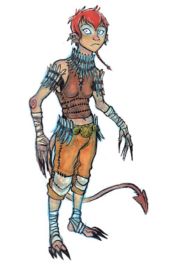
this first guy is just some quaint little costume jumped out of my head the other day...and some doodles of a race of goblin like guys that i doodle a lot. Ever since skyrim, i've been giving a lot of thought about designing a group of races that mirror the classics, elves men dwarves etc. and try to breath new life into them and make them unique and interesting......
moving on.....

This guy is a the beginnings of a character concept that i want to keep fleshing out. I like the idea of having the obligatory super soldier being very different and modified to help himself with the also obligatory super armor. So im trying to design this guy in layers, and the first being this fugly, scarred and covered in plugs for the direct interface of his nervous system and muscles into the second layer of artificial muscles that increase his speed and strength so he can handle the third layer, the actual armor.

This guy is a the beginnings of a character concept that i want to keep fleshing out. I like the idea of having the obligatory super soldier being very different and modified to help himself with the also obligatory super armor. So im trying to design this guy in layers, and the first being this fugly, scarred and covered in plugs for the direct interface of his nervous system and muscles into the second layer of artificial muscles that increase his speed and strength so he can handle the third layer, the actual armor.
3.27.2012
032712_more things to critique?
This is a variety post for me, but I just want more feedback on some of the stuff I've been doing for the Pixar portfolio if you guys wouldn't mind helping! I revamped those astronaut sketches that were on the character sheet previously and did this other kid sketch.
Thoughts? Critiques?
eth.
3.26.2012
3.25.2012
032512_WIPs!
Anybody got any works in progress they could share this day? No matter how in progress it is?
This first one is just about fleshing out characters. For the ol' Pixar portfolio.
This one I want to turn into some kind of hopefully epic battle sequence.
And this one is just going to be about huge robots. I want to pursue a lot of strong atmosphere and really capturing a space and a sort of culture too, maybe here? I don't know if culture is the right word, but I do want to give a sense of who these people are.
These are all probably about 1 hr in.
3.22.2012
3.21.2012
032112_a return!
Good news everypeople, I've quashed my self-doubt for the time being and I'm back to making work. Being unproductive sucks a lot and I can't really afford that right now. Crap has been dealt with and I'm on a good streak now.
Okay so, to set a context for your critiques: These are pieces that I'm working on for my Pixar art internship portfolio. I started doing all these little thumbnails for character ideas based on the sort of stuff i've been doing more recently in painting and then when I tried taking it to paint it just didn't feel like me.
So I switched gears and started painting this astronaut stuff, thinking I could keep playing with shape, which I know has gotta be important to those guys at Pixar, but also play more with color, which I feel is my real strength, and possible work with doing some rough color keys.
Speaking of color keys: http://louromano.blogspot.com/2009/06/up-color-script.html These are a bunch of color keys done for UP. They're super simple and at times they have some really weird mark making which almost can come across as clumsy, but boy do they tell a story. And how the color transitions throughout the
whole thing is really elegant.
I think I like the idea of continuing to explore color keys for my portfolio, maybe attempting to demonstrate some really quick, succinct storytelling in just a few panels.
Anyways, your guys' critiques were super awesome last time and I feel waaay lost with this work at the moment.
eth.
3.20.2012
Terra Nova Drifter turnaround
This started off as a test for a new pencil brush I found for PS, and I needed to kind of concrete this character a little bit so I wipped up a turnaround for him. Not exactly a full model sheet but I think it gets the design across.
Also, does anybody have any ideas on the color of his visor/faceplate? I always kind of pictured it the nasa/halo solar reflective orange-yellow, but when it has that it feels waaaay derivative of halo, especially the EVA helmet. I stuck with a pale grayish blue, but I just dont feel very strongly about it...


blarg! work in progress!
ack. im trying to get an actual concept piece instead of just character designs.. ugh...i dont even like her design.....but, i felt i needed to put SOMETHING up D:
3.16.2012
design iterations
Okay guys, so you're going to need to be rough with me on this one. I feel soooo rusty with concept design right now. Here's a couple of designs that I sketched out the other day and just finished. I'd like to take this guy and just run the complete concept process, thumbs, sketches, iterations, final paint design and then something that's a little bit more contextual, him in a scene and stuff.
I'd also like to pose a question for you guys: Do you ever feel like you end up making your designs more conservative or conventional as you go through the design process?
I pretty much completely did away with the bubble helmet as I moved forward with these and I'm wondering if that was a mistake.
eth.
3.15.2012
quick sketch
Just a few idea generating thumbnails. Need to do a few more pages like this, maybe over the weekend.

3.11.2012
a new challenger enters the ring!
Hey fellers,
I recently had a chat with a former KCAI grad and all around nice guy who might want to join our little blog. His work is similar and yet very different to most of our stuff, so he Might provide an interesting angle for critiques.
His name is Dustin Lincoln, and his stuff can be found here:
http://dustinlincoln.blogspot.com/
Since he is already on blogger, can we just send him an invite as a contributor or something? Im not sure how that works. And you would have to do it Eth, I don't think me Or Ali have any administrative abilities on our end.........
So lets make this Happen!
one of us!
one of us!
copic sketches
So I've been trying to work my way over a hump as far as art goes, and have been forcing myself to sketch more regularly. For some reason i keep drifting toward my brush pen and copic markers, so here are some blue people and a fat little redman that has been popping up all over the place who might have life as an animation later on down the road.
3.05.2012
Guilty
Alright, I feel sufficiently guilty, AD. I'm sorry I haven't posted anything in forever. Here are two speedies. 15 for the b/w and 25 for the color, I want to experiment more with the depth of field thing I see artists like Peleng using. I think while it could easily become a gimmick, it seems like a powerful tool because it adds a sense of depth and a photographic/cinematic quality to works that are more gestural.
I'm kind of sick of all the photo-realism that I see, though I can understand it's purpose and how it's really helpful to modelers and texture people, but at the same time I think good concept art no matter what style it's done in will give enough information for others to build off of it with. What do you guys think?
3.04.2012
yo yo yo!
some dailies, I'm actually wondering if I should be like hannes and just go waaaay back to basics to properly hammer in anatomy and lighting. but take a looky at these and can you guys let me know why my skin tones look so mushy mushy?
Subscribe to:
Comments (Atom)


