So one of the ones that stands out to me the most as being really interesting is the top right one. It's strange though because there's not really a solid sense of scale, unless we assume that those little lines are figures, it's just bizarre. The value range in it is really nice as well, though. I think that having a broader value range and more atmospheric perspective could help these space in some of them. Like the top left one, greying out the building, even though it's backlit, could help set it back further in space. Nice thumbs!
These really remind me of old school magic the gathering card art in the way that they seem to have a focus, like a specific illustration of a magical effect or area. Ive been trying to hype myself up to doing more personal environment stuff and i think ive come to the conclusion that it very hard to make interesting environments. Not just in the setup and composition, which are challenges in themselves, but in the subject matter.
All of these look like they are ready for a title and a bit of flavor text. Nothing Bland here at all, which is a huge strength, and the most important part of the process of making interesting images. They make you wonder, immediately, "what the fuck are those birds doing?" or "jesus, is that a sarlac pit spewing souls, while a circle of wizards cast a spell?"
Implying story is very important, and makes you what to study it, even if it isnt immaculately rendered or even in full color.
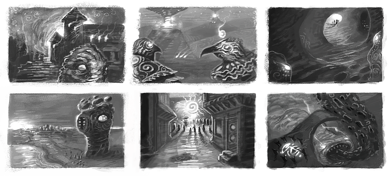
So one of the ones that stands out to me the most as being really interesting is the top right one. It's strange though because there's not really a solid sense of scale, unless we assume that those little lines are figures, it's just bizarre. The value range in it is really nice as well, though. I think that having a broader value range and more atmospheric perspective could help these space in some of them. Like the top left one, greying out the building, even though it's backlit, could help set it back further in space. Nice thumbs!
ReplyDeleteThese really remind me of old school magic the gathering card art in the way that they seem to have a focus, like a specific illustration of a magical effect or area. Ive been trying to hype myself up to doing more personal environment stuff and i think ive come to the conclusion that it very hard to make interesting environments. Not just in the setup and composition, which are challenges in themselves, but in the subject matter.
ReplyDeleteAll of these look like they are ready for a title and a bit of flavor text. Nothing Bland here at all, which is a huge strength, and the most important part of the process of making interesting images. They make you wonder, immediately, "what the fuck are those birds doing?" or "jesus, is that a sarlac pit spewing souls, while a circle of wizards cast a spell?"
Implying story is very important, and makes you what to study it, even if it isnt immaculately rendered or even in full color.
so good first post, keep on keepin on!