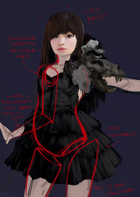
Alison--since it seems like we can't post images in the comments, I was thinking maybe we should take advantage of our digital medium and do paintovers of each other's work to show what we're talking about. I know that on CA in the past you used to see a lot more of this going on.
 With this one I would mostly just suggest you consider your lightsource! Give us some shadows and highlights, the face on this one looks really nice but seems like there is maybe just a flash right in her face or something?
No comments:
Post a Comment