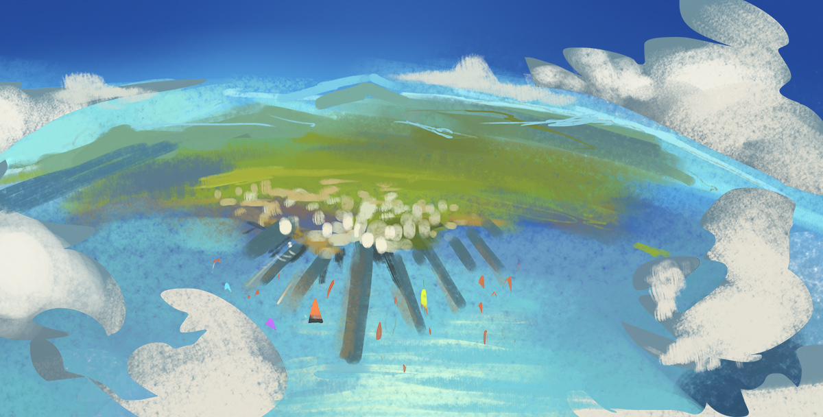
Still working on defining a real solid look for the short, but we're getting there!


eth.




 The first of these is that in the most effective concept pieces, the artist took every chance they had to use perspective. Every chance. It's to the point where I would wonder if the design is almost determined by the needs of the image at times, meaning the shapes of buildings and their surroundings change in accordance with the composition, not just the ideals of the artist. In Andrew's piece he's turned the ground plane into a grid so we can easily see receding space as well as using atmospheric perspective. He also reinforces the perspective by having repeating columns on the sides that are basically perspective markers. The scratchy lines on the pavement also make sure that the ground really appears flat.
 Craig Mullins is of course the man, and one thing that I noticed about his works is that whenever he has flat surfaces, any at all in his environments, he puts a texture or pattern on them to let us see how it recedes. Rarely do you ever see him use flat color. The result is this awesome grid floor which, in addition to the figures standing on it, let us see tons of space. He's a master of atmosphere too, and that helps.
 This piece by Hideyoshi does a lot of things well but falls short in other ways. It's increbly detailed and complex, but it really just goes to show how you cannot use some of the rules of perspective and ignore others if you want to create something that is really successful. His super tight line drawing is beautiful in the foreground but as you get to distant buildings with the same amount of detail, it destroys the space and the illusion is lost, the lack of atmosphere and loss of detail that you find Mullins' work I think is really holding back this piece, no matter how good it is technically. That said, this guy is consistently awesome and this is a much older piece of his, talk about a draftsman.
 That was probably a huge torrent of blather that none of you wanted to hear but verbalizing for myself helped me really solidify things that I'd learned from really looking into these artists' work. I ended up just seeing how I could try to build images with lines and composition to see if I could get THAT right first before I try going into an expanded value range and the use of color. Nothing to sneeze at but I don't think that's really what we're about here anyways. It's learning right? Thoughts please on all of the above and below?
 eth.
eth.

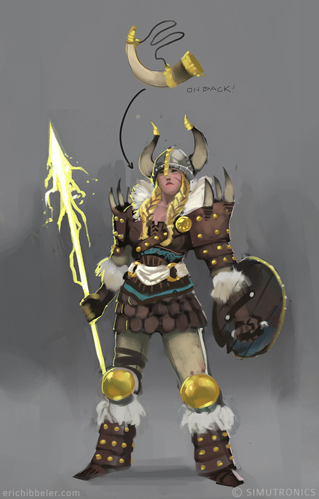
 With this one I would mostly just suggest you consider your lightsource! Give us some shadows and highlights, the face on this one looks really nice but seems like there is maybe just a flash right in her face or something?
